Some digital cameras have problems with setting the so-called white balance correctly. Sometimes even you may have difficulties, or you may use a wrong setting out of absent-mindedness. The result: White walls are yellow, blue or purple (never realistic), and a strange colored haze sets over the whole picture. Here you can read a useful photoshop tip about getting the original colors – or those of close resemblance – back.
 This image shouldn’t look so greenish. Let’s try to correct it by creating a Levels layer mask.
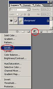
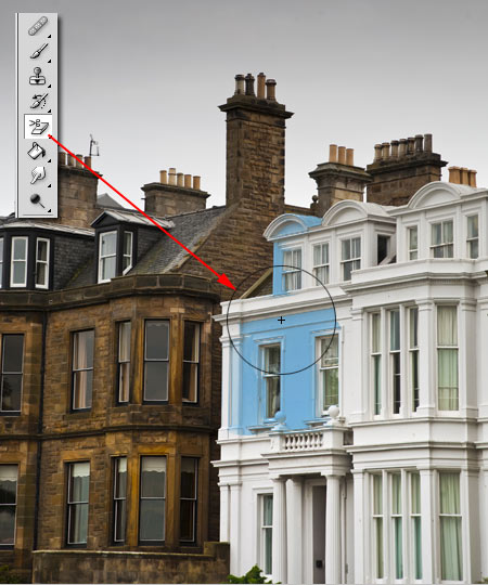
You may do so by clicking the icon you see on the picture on the Layers palette in the lower-right corner. Choose Levels from the drop-down menu.
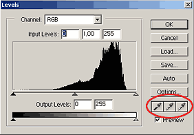 The Levels window appears. By using the 3 eyedropper icons on the lower right, you may assign reference points for Photoshop to signify the appropriate hue for each eyedropper. From the left to the right, the three eyedroppers are for setting darks, midtones and highlights, respectively. The first and the last one is mainly used for setting brightness, but the middle one is very useful in correcting shifted colors. Simply put, by clicking a pixel with the middle eyedropper, you tell Photoshop to assume that pixel is mid-gray. All the other colors will be shifted accordingly.
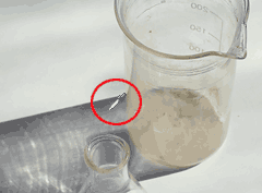
So click that middle eyedropper, and then click a pixel on the photo that should be mid-gray. You can see that other colors are modified accordingly. You can click several times while searching for the appropriate pixel to get the most realistic colors where white is white, gray is gray, etc. In this example, that pixel is somewhere around here:
If you cannot find a mid-gray point in the picture, you can try the left or right eyedropper, but be sure that select the darkest point when using the dark eyedropper, and the lightest one, when using the light eyedropper. These tools can also modify the brightness and contrast of the image in a great deal.
Note: If the picture if not very small, it may be worth to click the Color Picker tool (I key) on the Tools palette, and set Sample Size in the above options to a higher value, e.g. to 3 by 3 average. This way the eyedropper takes a 3-by-3-pixel area (or 5-by-5, if you set it even higher) instead of a single pixel as a reference. When using a single pixel, it may contain noise information, so it won’t lead to realistic colors.
If the photo finally contains the right colors, click OK in the Levels window, and go to the Layers window on the right.
While setting the appropriate colors, you may have also shifted brightness in an undesirable way.
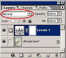 You can see two layers on the Layers palette: The layer for the original image, and above it, the Levels layer mask. To make Photoshop ignore the change in brightness, select the layer called Levels 1 and set Normal instead of Color. This way, only the change in colors can be seen on the picture below the Levels layer, lighting does not change. Merge the layers by clicking Layer/Flatten Image and you are done!
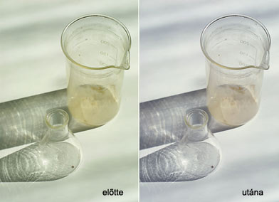
before / after