“Curves”. If the word catches you unprepared, you might well think of a line not too straight. However, in image editing, “curves” means something completely different. Err, something partly different. The Curves feature is a contrast and brightness adjustment tool in premium editing applications that is well-liked by advanced users. The new edition of Photoshop Elements finally includes the simplified version of such a tool.
Load the photo in Photoshop Elements

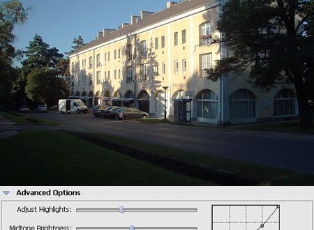
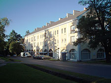
This is today’s experimental subject, demonstrating the Curves feature in Photoshop Elements 5.0.
Curves
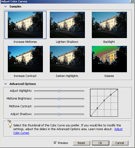
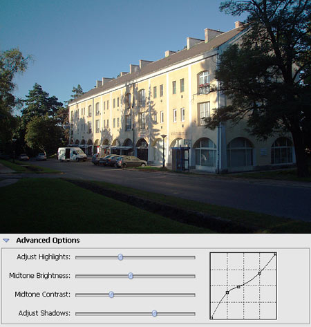
Click Enhance/Adjust Color/Adjust Color Curves. This is what the dialog looks like if you clicked Advanced Options at the bottom. But let’s focus on the top first. You can see 6 previews that help you adjust the brightness and contrast of your photo with a click. You don’t even need to have thorough knowledge of the curves. If you find this simpler interface satisfying, forget about what we were rambling on, and use the new feature happily (or grumpily, if you like). Clicking the six preview images leads to the following actions:
Increase Midtones: Increases the brightness of the picture. Midtones get lighter in particular, dark areas and highlights only do so to a smaller extent.
Lighten Shadows: Only the dark areas are lightened.
Backlight: Increases contrast for back-lighted photos and tries to bring out details.
Increase Contrast: Increases contrast, obviously.
Darken Highlights: Darkens only light areas.
Solarize: Use it to ruin your photo. Generates unnatural colors.
This was the easier part of the job. Real possibilities are displayed only when you open the Advanced Options region. You get four sliders, plus a tone curve on the right that cannot be adjusted by dragging, it just serves feedback purposes.
Highlights

The first slider, Adjust Highlights, lets you manipulate the highlights, i.e. the lightest areas of the picture. Drag it to the left to darken or to the right to lighten these areas.
The left-side example image above shows the slider’s effect when dragged all the way to the left. The lightest parts of the picture (mainly the building) got a bit darker, but the lighter parts of the sky became rather grey. Unfortunately, the areas bleached by a wrong exposition cannot really be mended with this tool. Instead of white, you get grey.
Midtones


Midtone Brightness increases or decreases the brightness level of midtones.
Contrast


Midtone Contrast also effects the midtones, but adjusts their contrast.
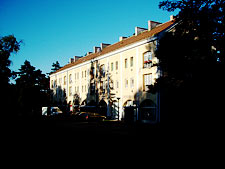
The left image shows the slider dragged to the extreme left that produced a very rough contrast. Light areas got almost completely bleached while the darker ones dropped dead.
Shadows
Adjust Shadows lets you make the dark, shadowed areas of the photo lighter or even darker.
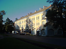
Some kind of result
We’ve played with the sliders a bit, and this is what we’ve got. First we clicked Lighten Shadows. Then we’ve decreased the highlights and slightly the midtones as well. Midtone Contrast also got decreased a little, but on the other hand, we’ve increased the shadows’ brightness with the last slider.